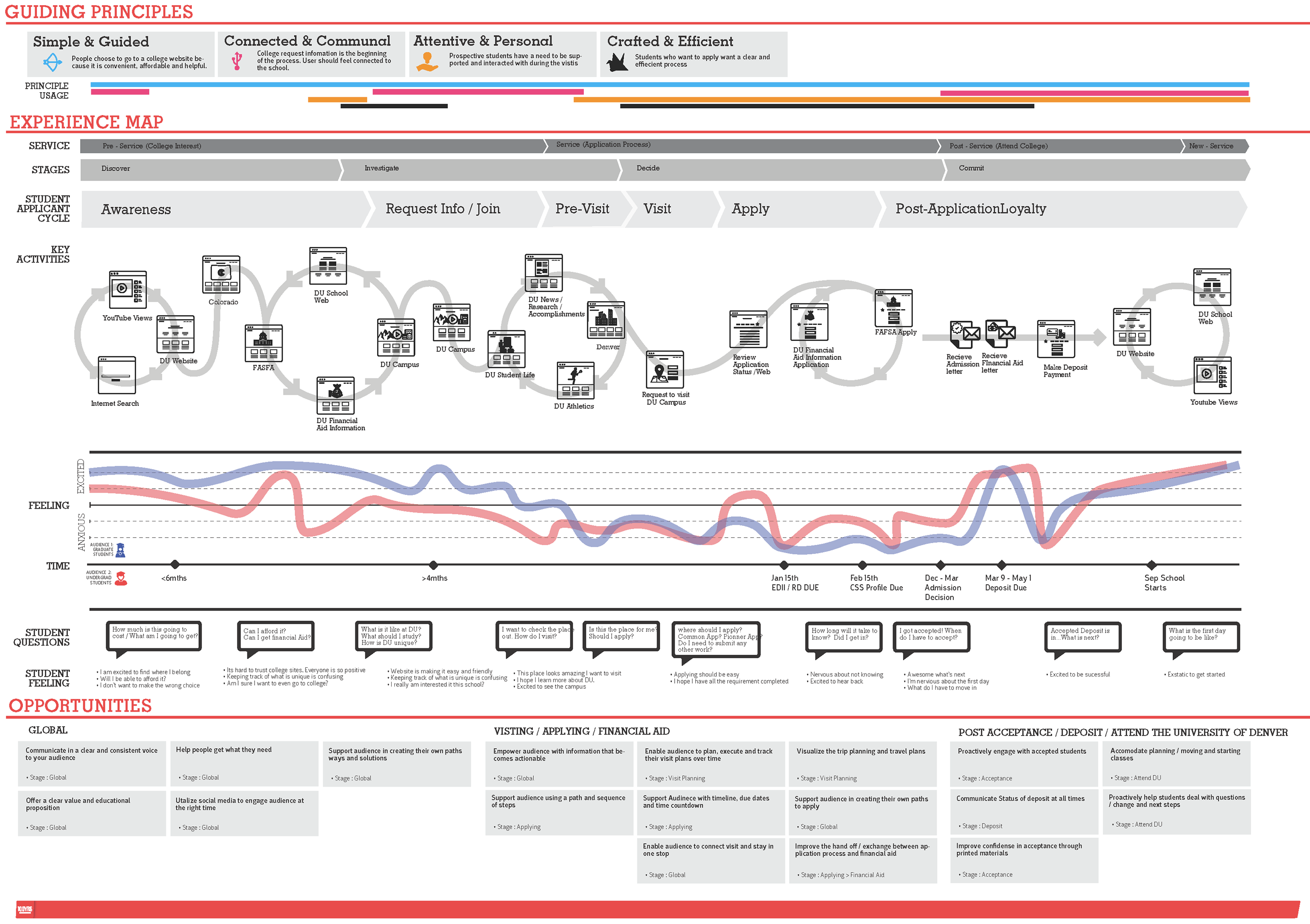
DU User Journey Map Process
A broader customer journey map that represented the emotional journey of the DU.edu student users along the process.
View Behance Case Study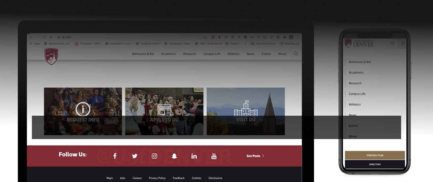
Published on 2014 by DU.edu on UX design
Select an anchor link to jump to that content.
Challenge Definition > IA Theory > IA Analysis > Card Sorting > New IA > New Sitemap > Final Navigation User Interface > Key Take Aways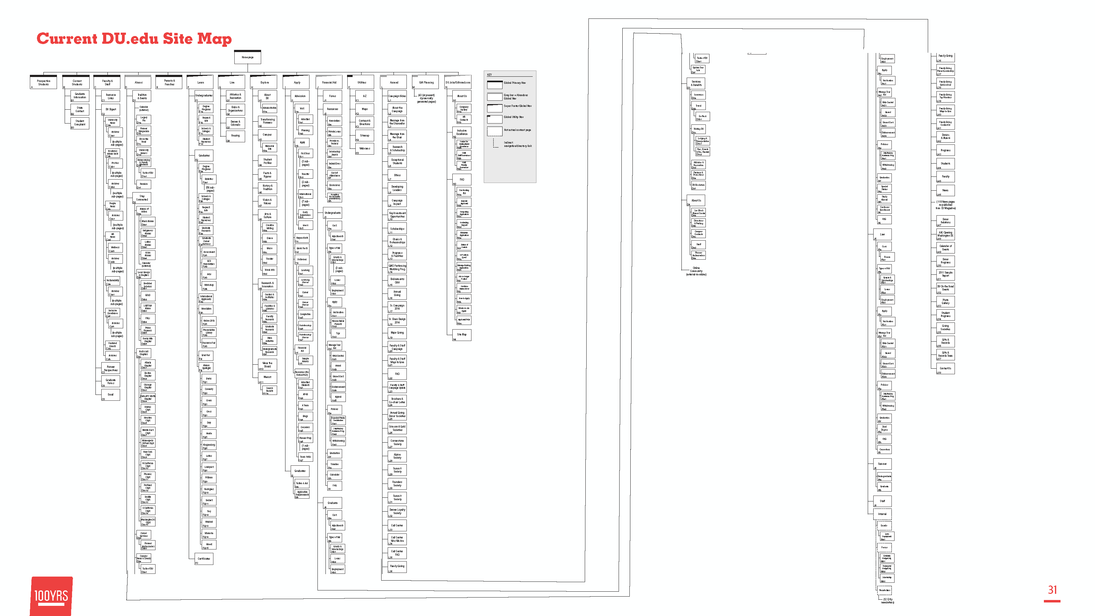
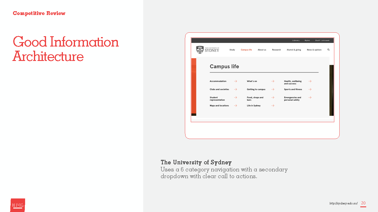
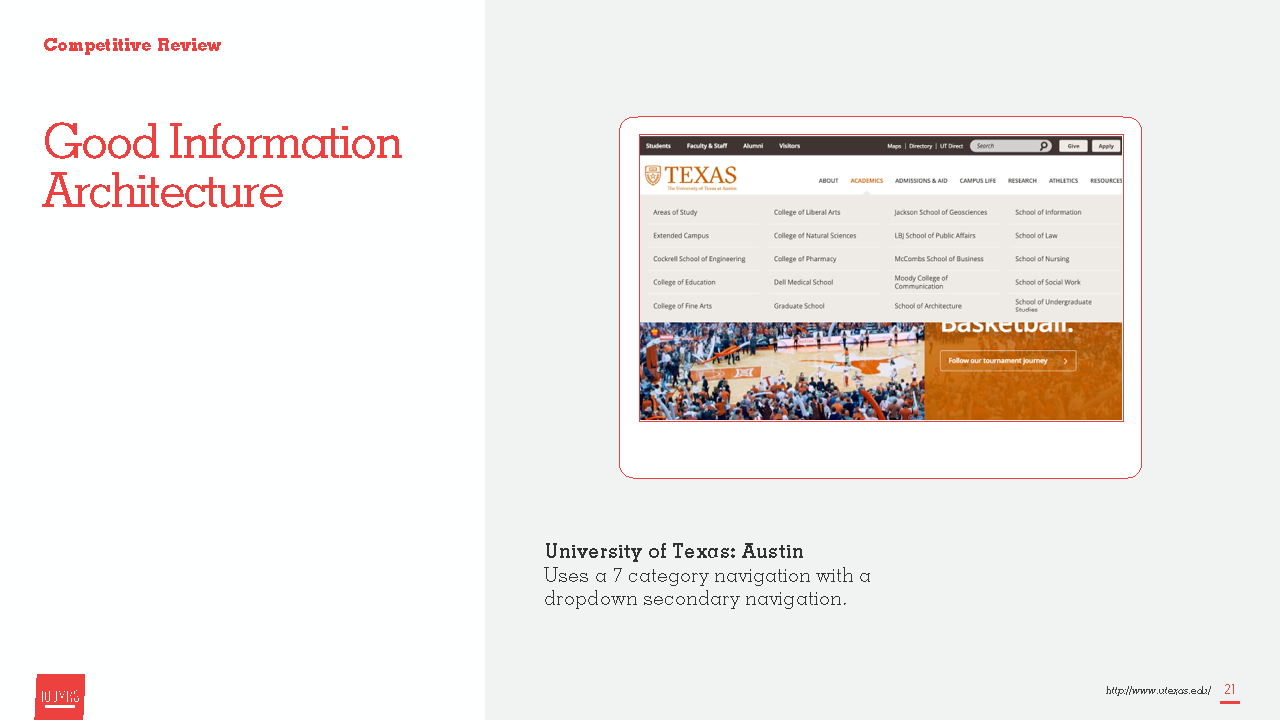
The website is like a space, it's like a building. It represents the University to the ouside worldm, and people here in Denver think about the campus as a beautiful physical space... our website needs to be the virtual space, the place, the inofrmation source, the image, the represenation of everything wonderful that the University is, just like our physical campus does."
- DU Steering Committee Member
Information is essential to any business and universities hold their sitemap and page titles quick tightly. At the point of our involvement The Unversity of Denver had not updated their website in 7 year and their information architecture had not been updated for more than a 10 years.
Inoreder to bring DU.edu into the modern webworld we explore what the university space was pushing.
Working with university administrators, faculty representatives, and the marketing department made the project a tricky balancing act. However the nice thing about working with instutions of higher learning is that they don't shy away from an opportunity to learn themselves. We helped by including information design theory to bring our clients up to speed and rationalized some of the IA decisions.
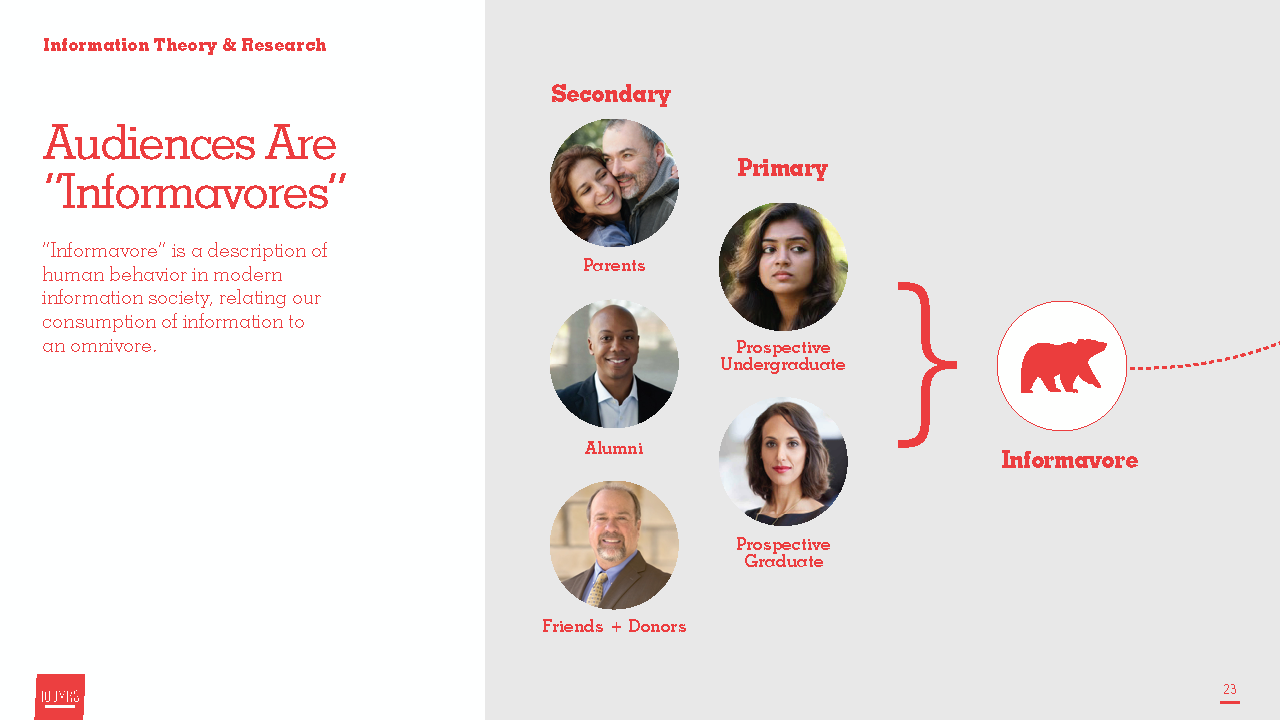
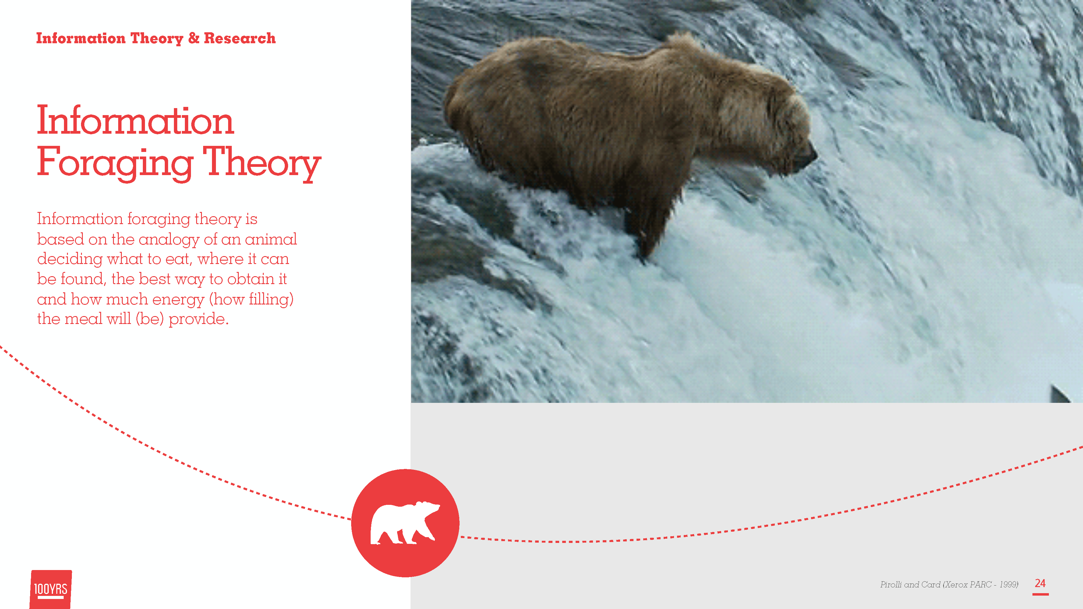
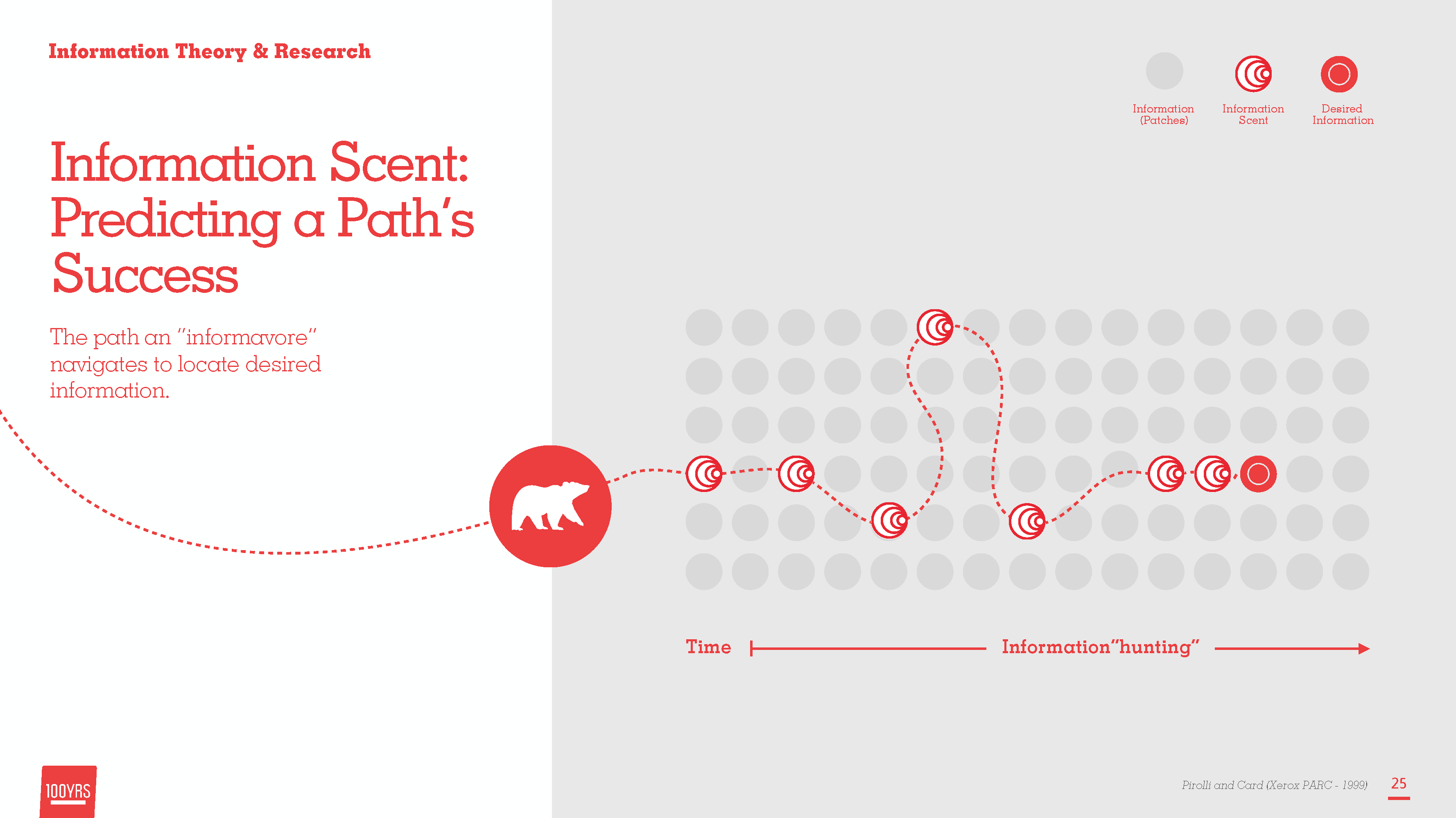
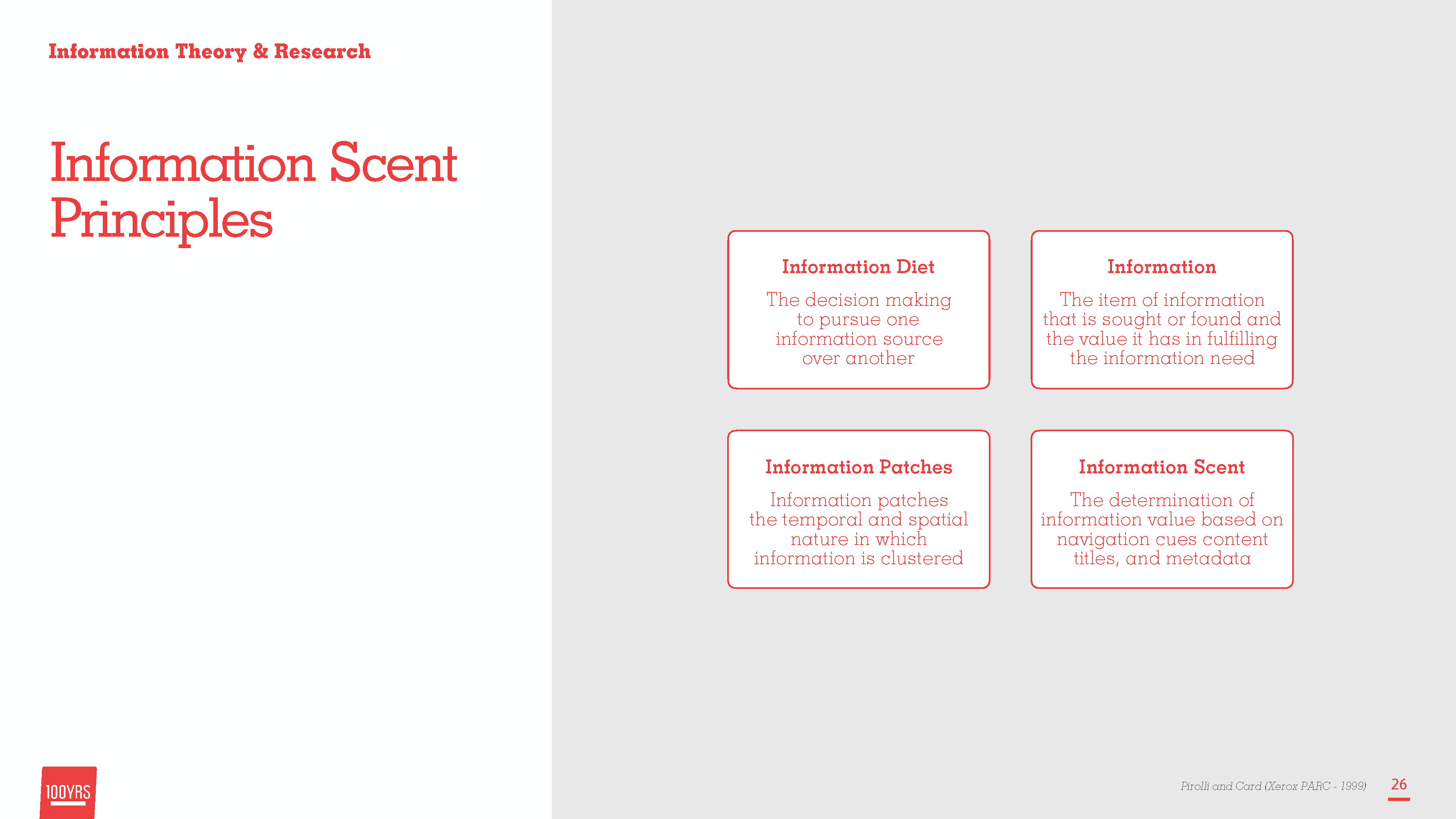
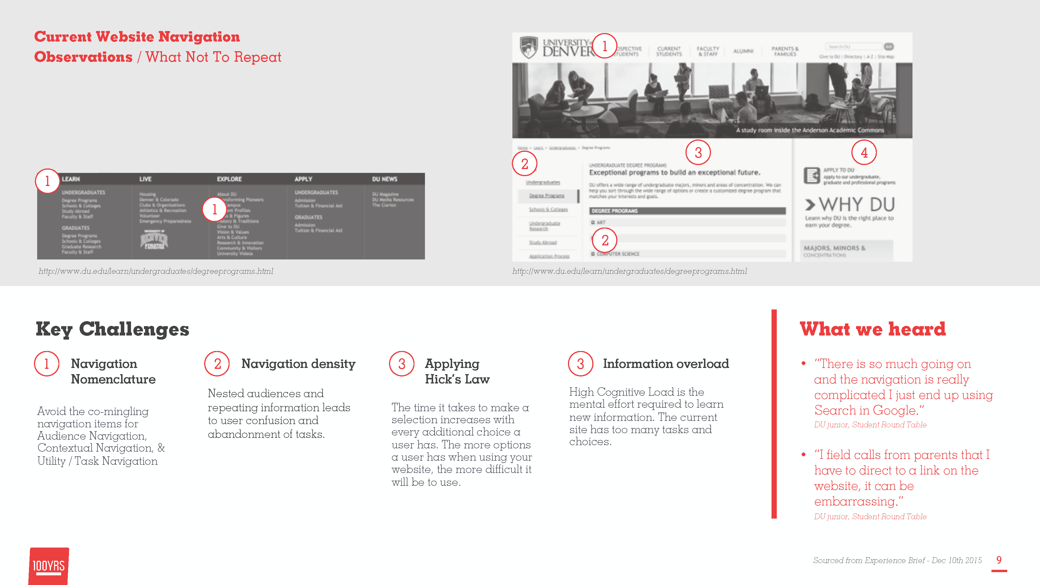
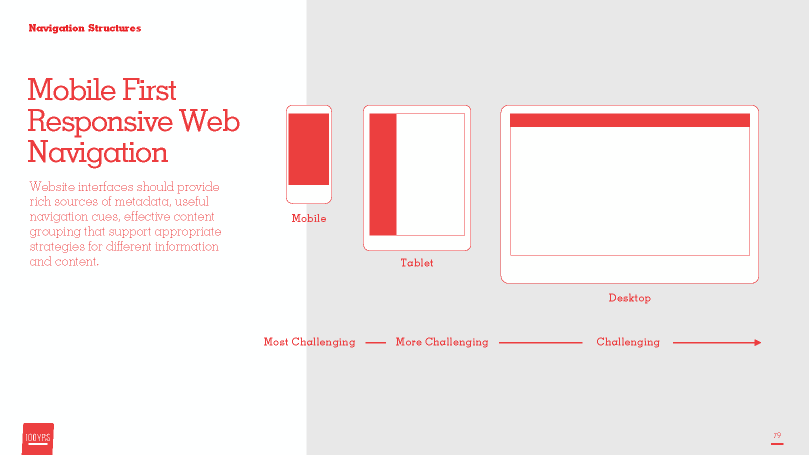
Faced with several navigation options, it's best if "informavores" can clearly identiry the trail (information scent) to the prey (information) and see that other trails are devoid of anything edible
Your user wants clear cut relationships of how it relates to the users task.
Your user don't understand yet and you don't want to throw them off the scent before they have the change to find what they are looking for.
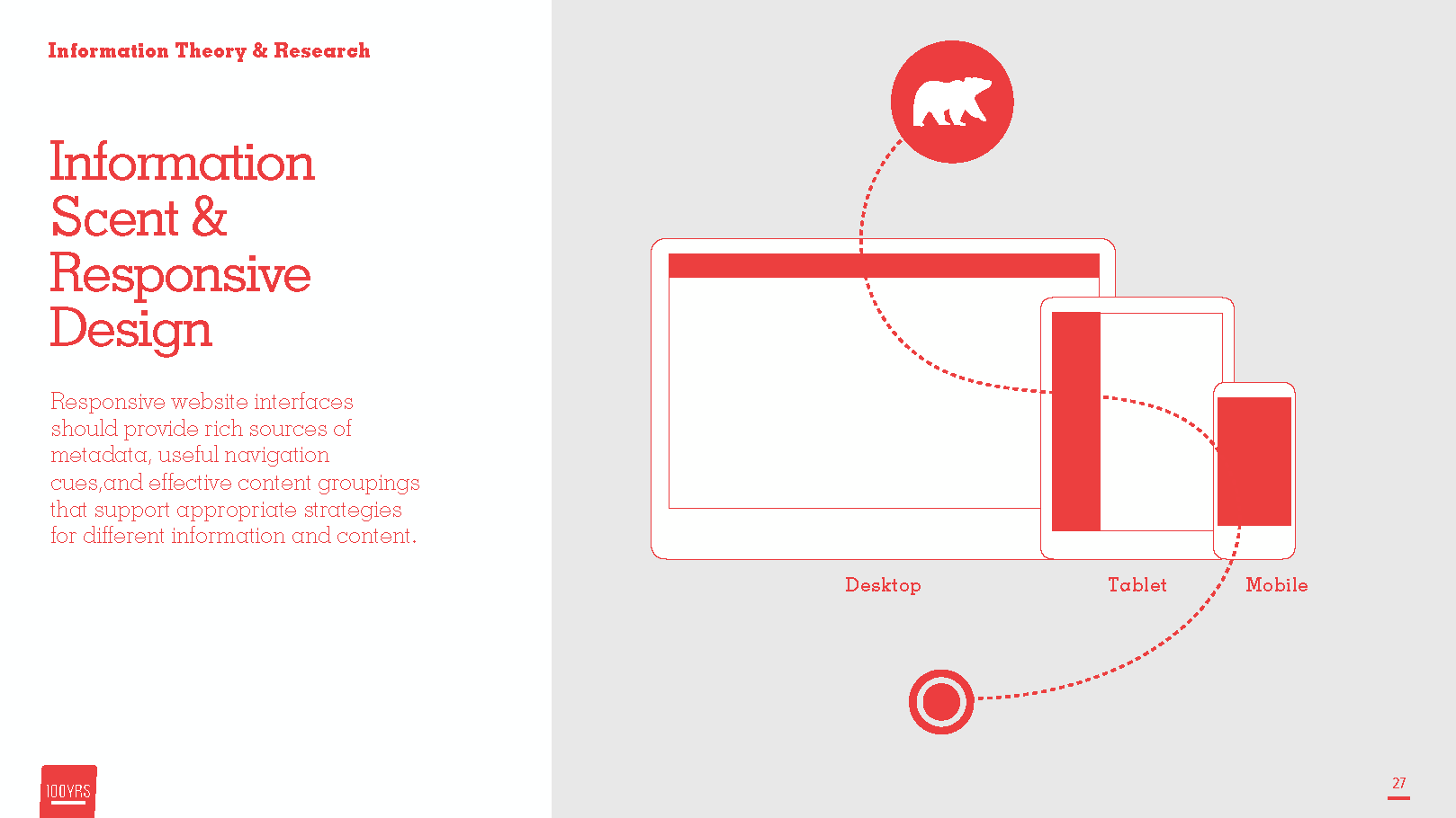
Search engine crawlers and accessable language tags will help improve your websites SEO and improve ratings and access due to consistency and clear communication.
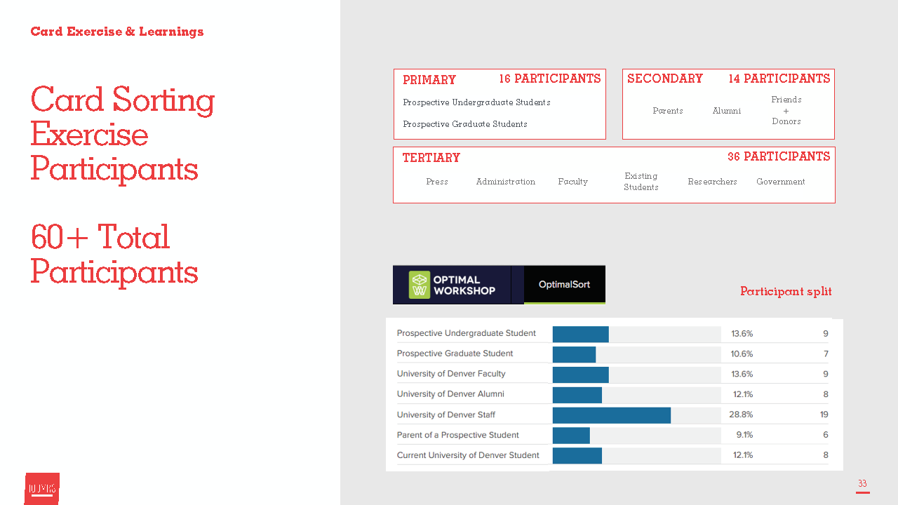
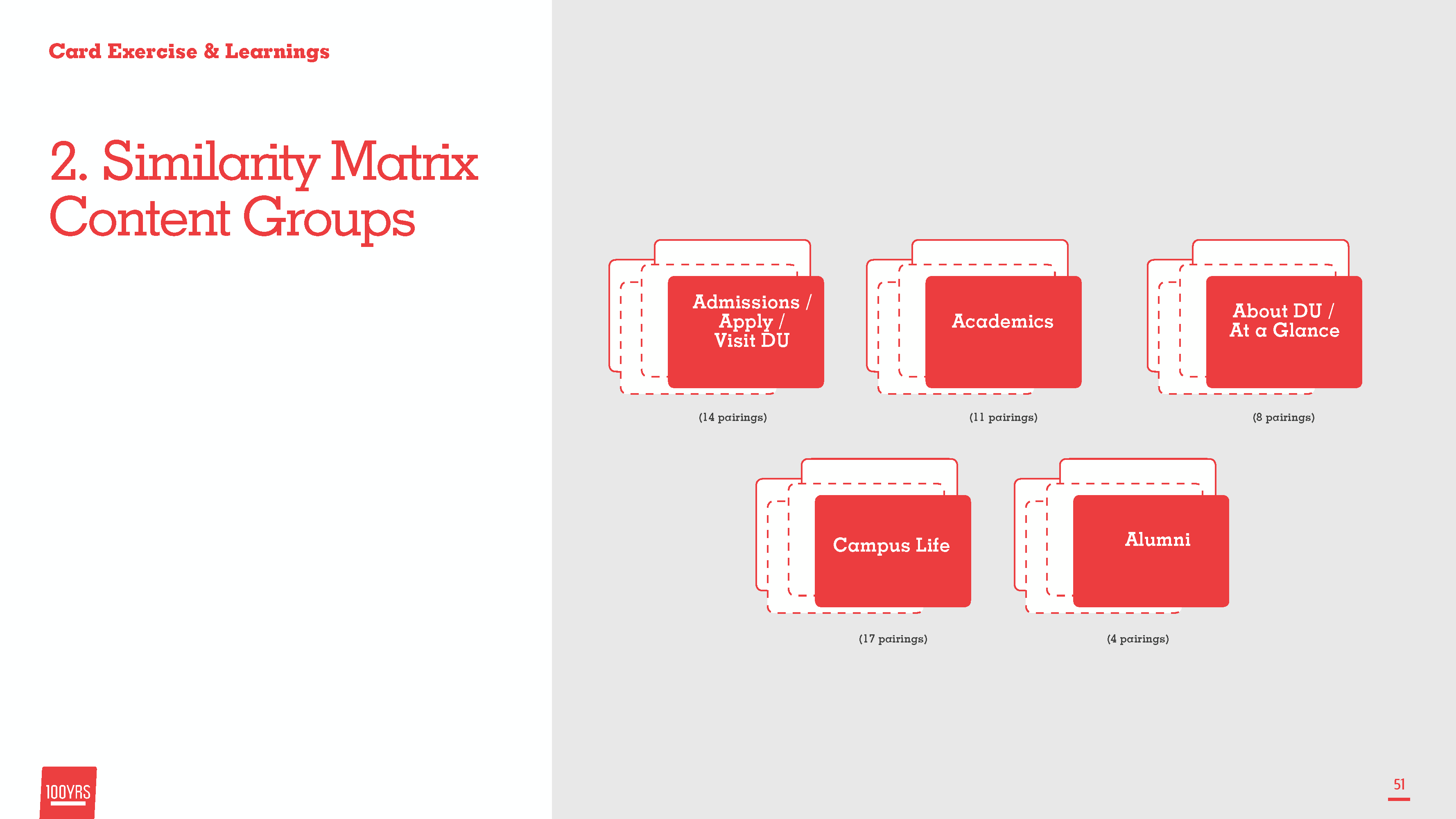
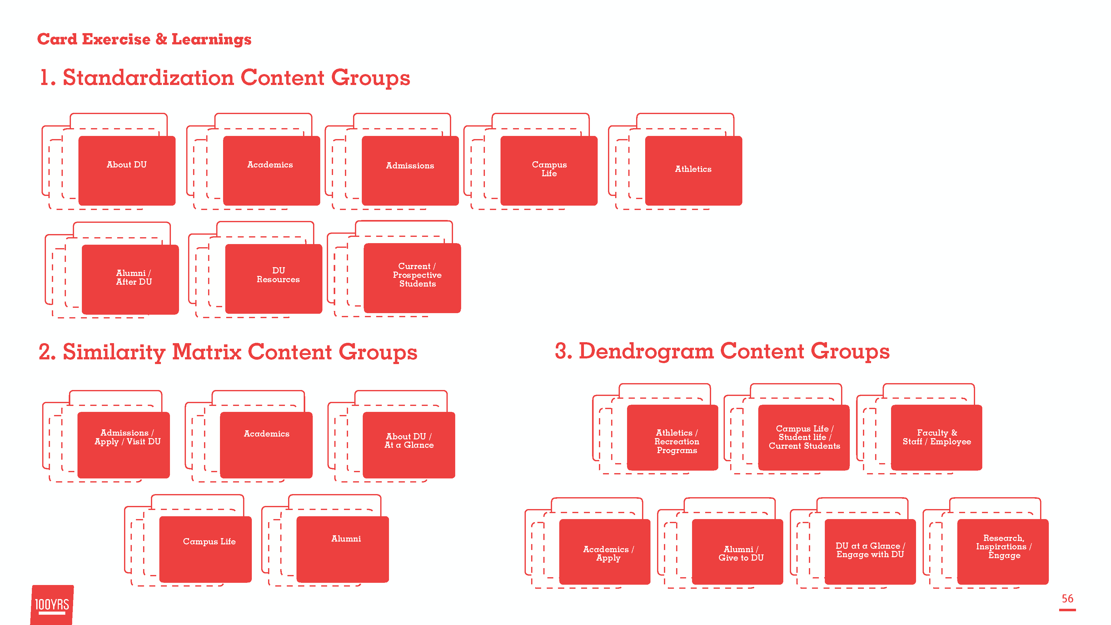
By participating in a card sorting exercise we believe our information architecture during the redesigning will be truely informed by and useful to our users.
Working with university administrators, faculty representatives, and a small set of students we used optimal sort to card sort the current Information architecture to user test and formulate a new path forward.
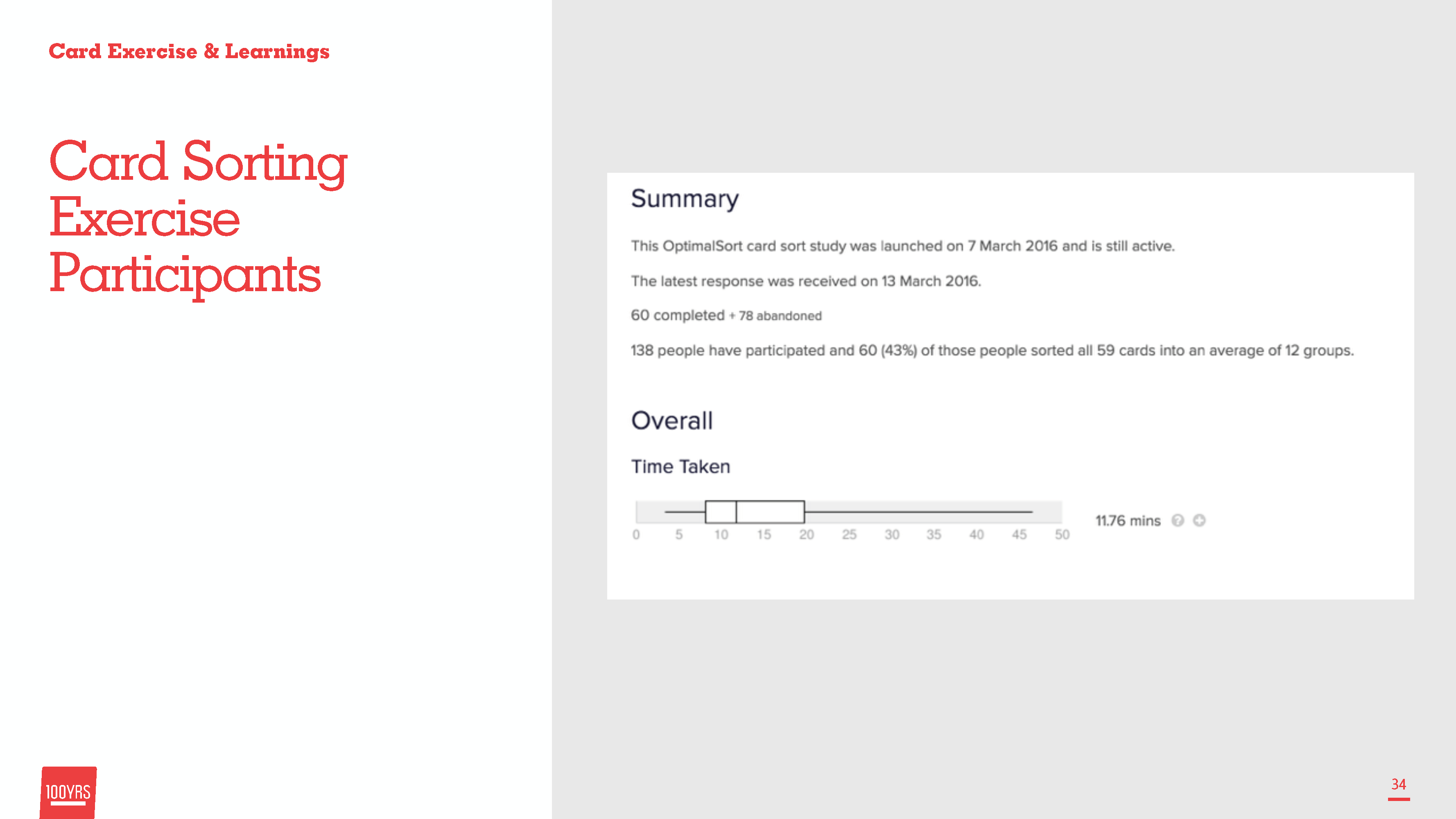

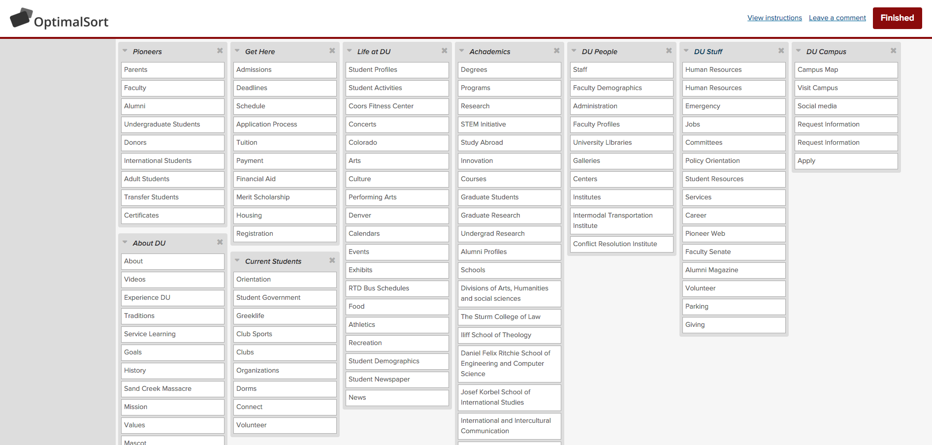
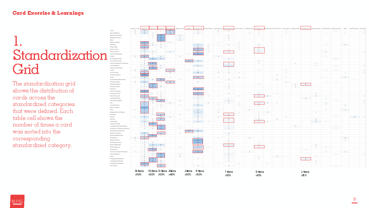
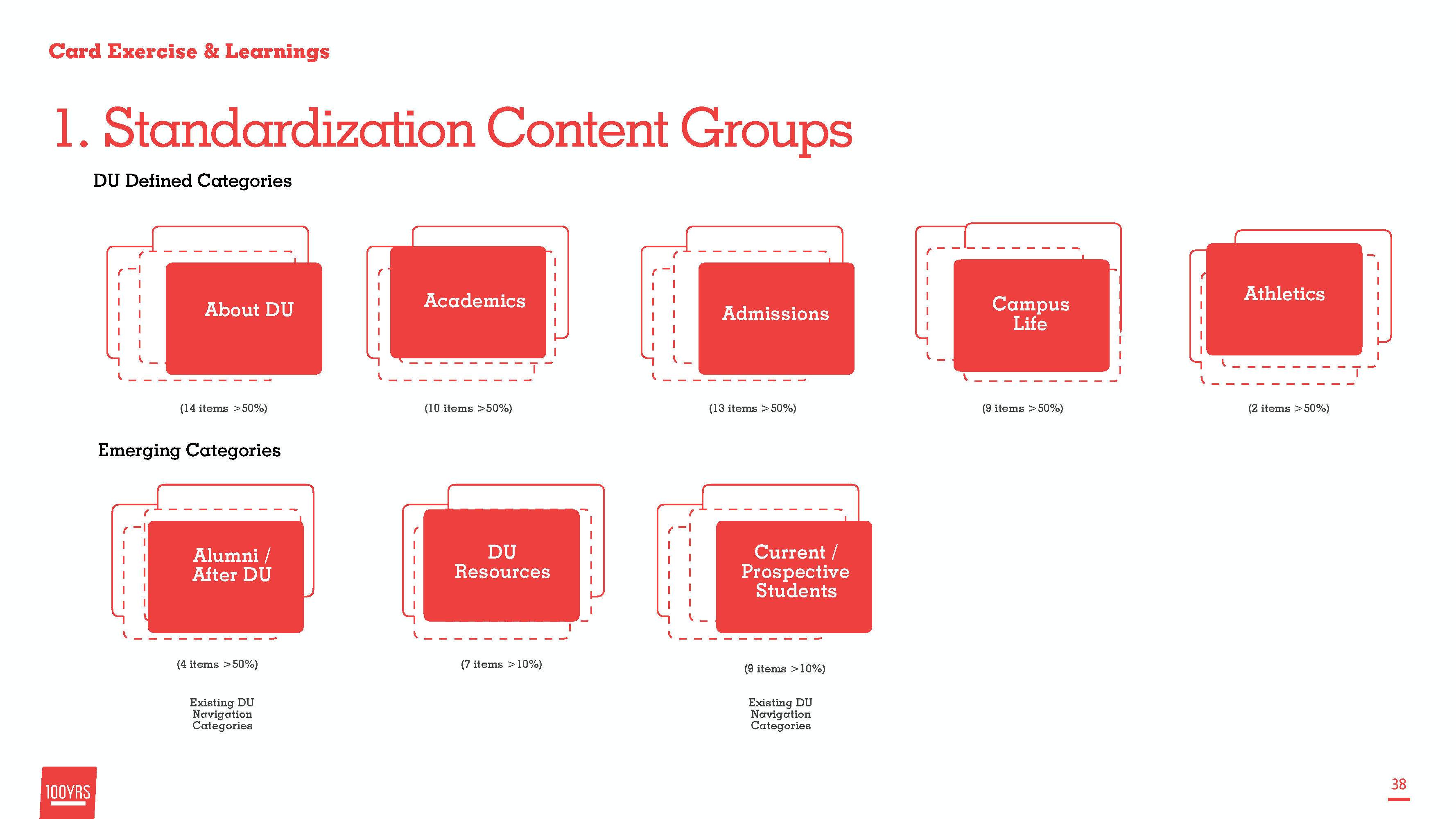
Using Optimal Sort we ran analysis on the card sorting user research
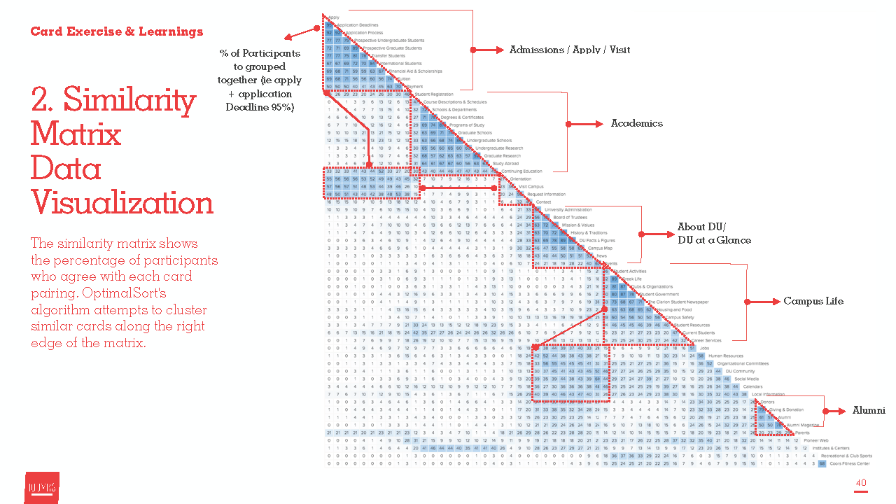
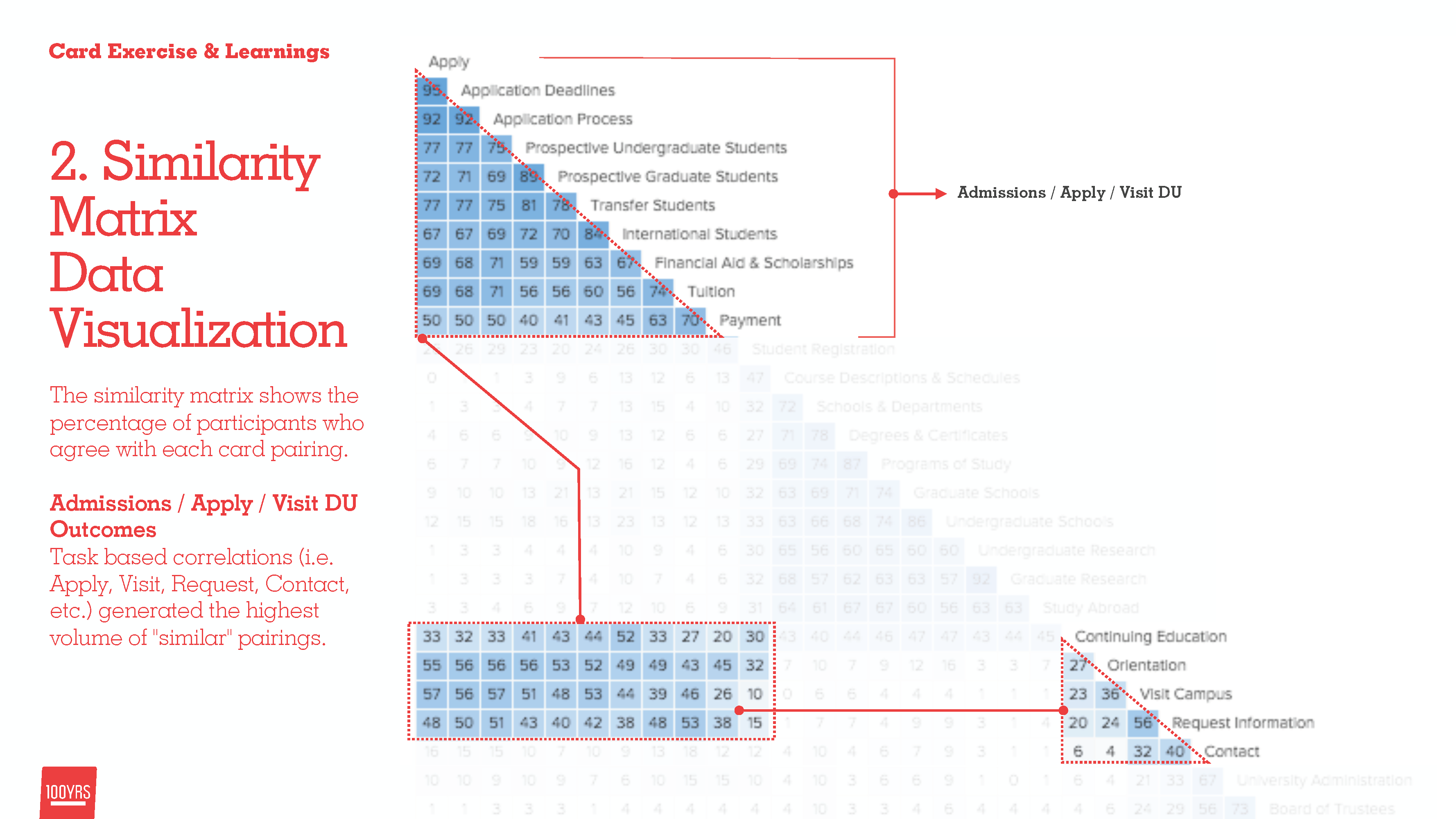
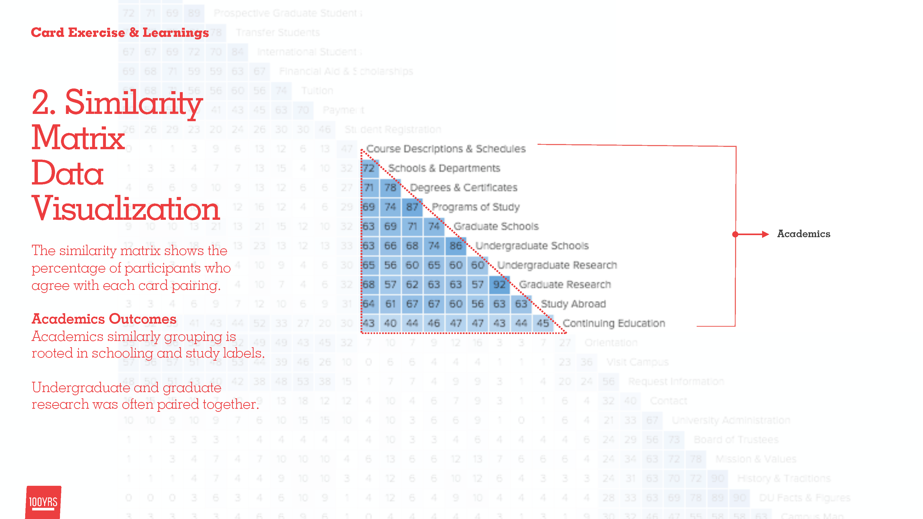
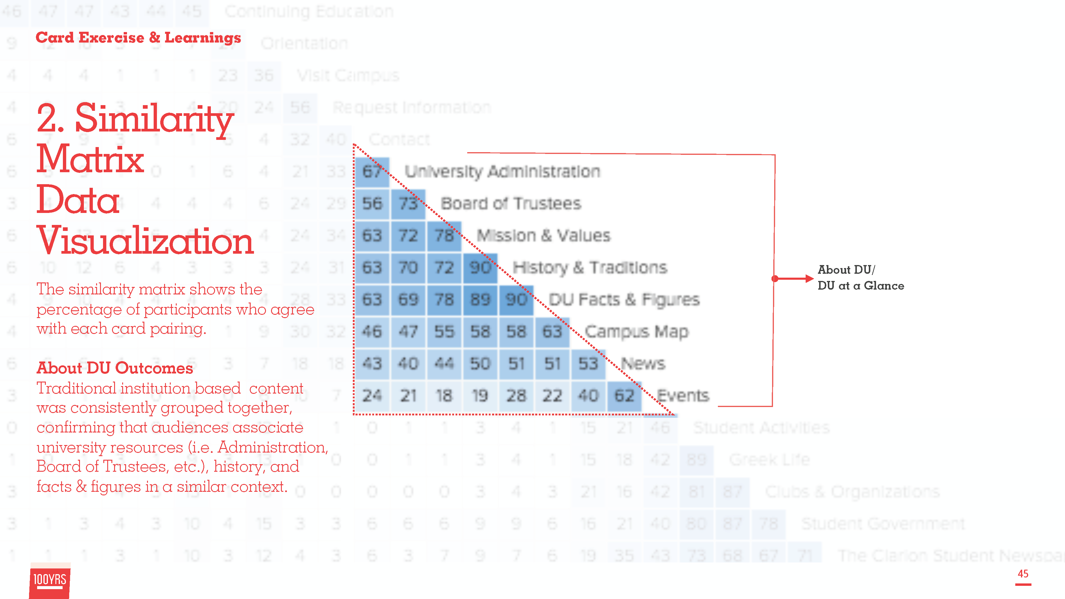
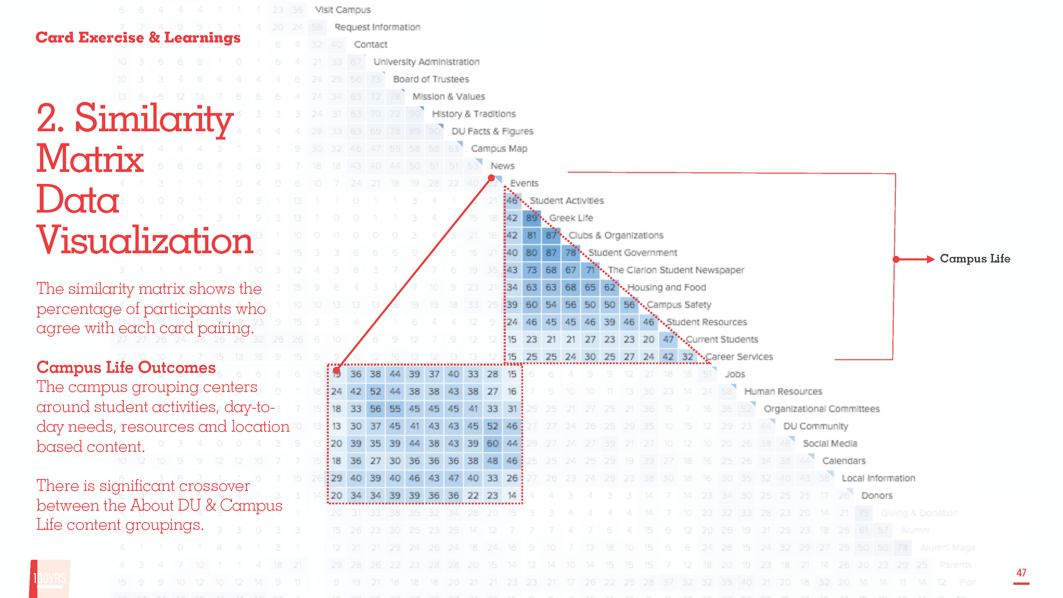
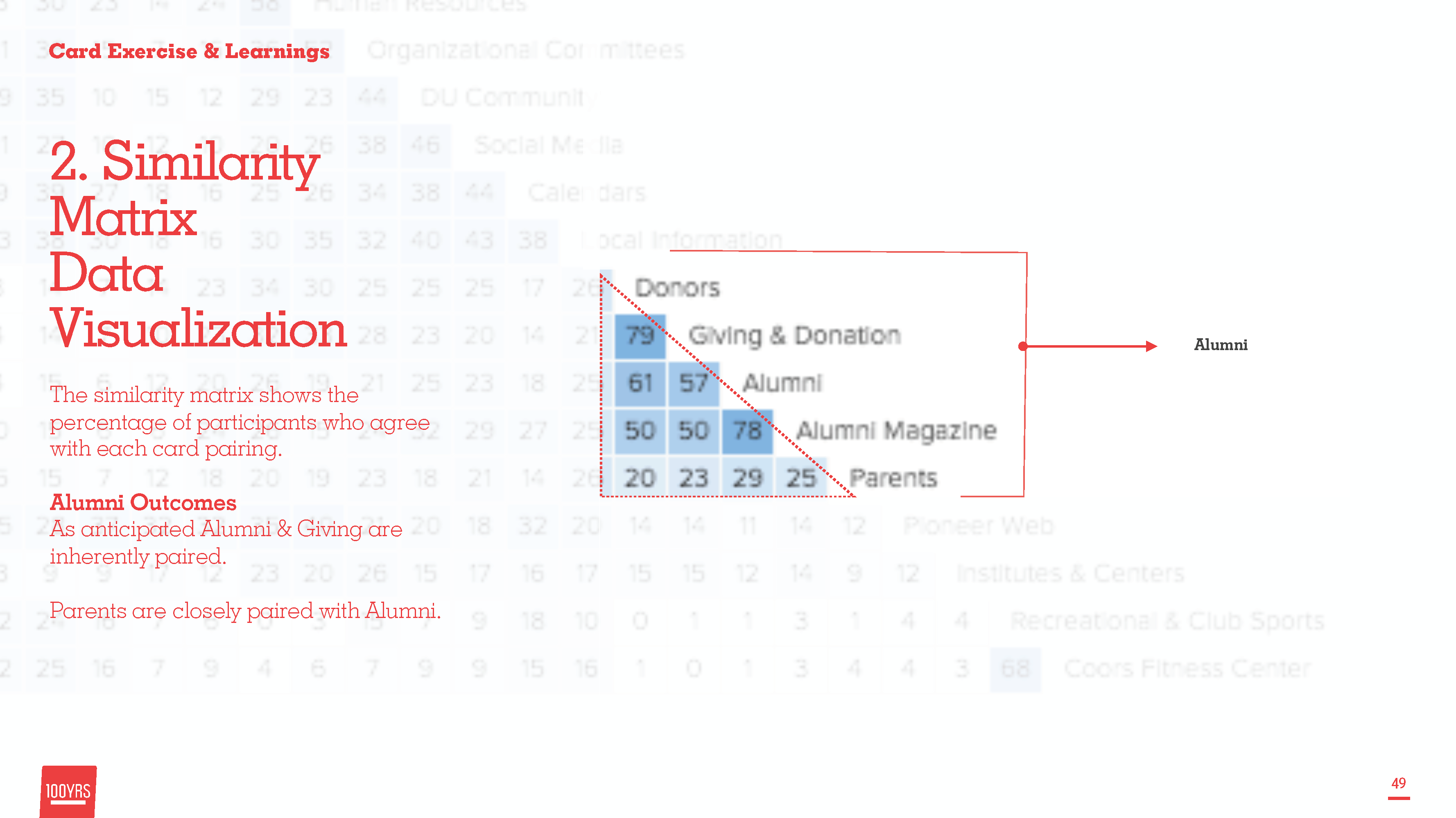
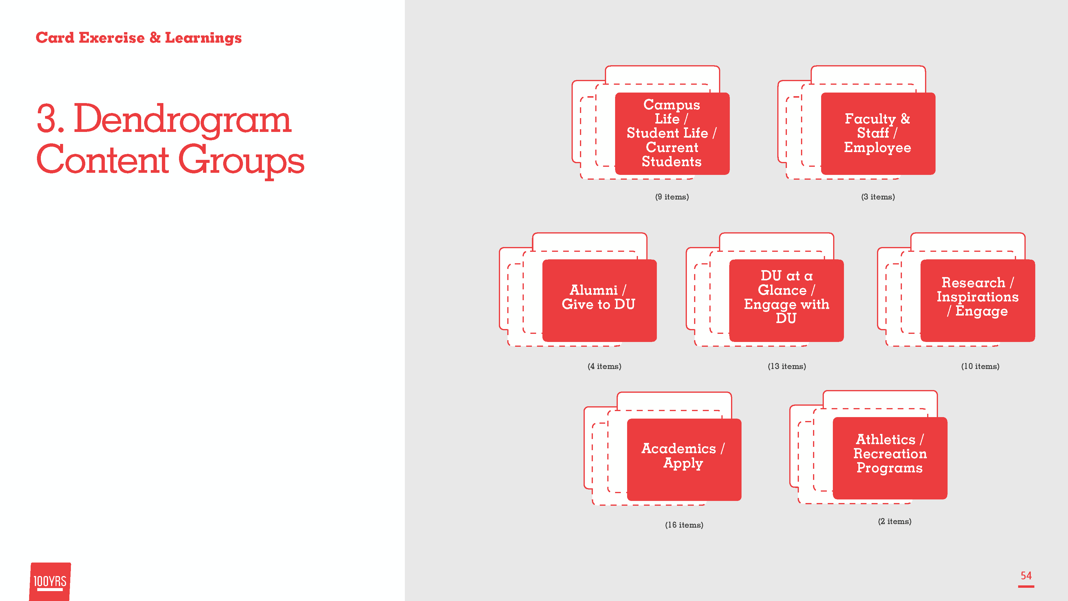
We ran dendrogram visualization as well to show how groups were applied.
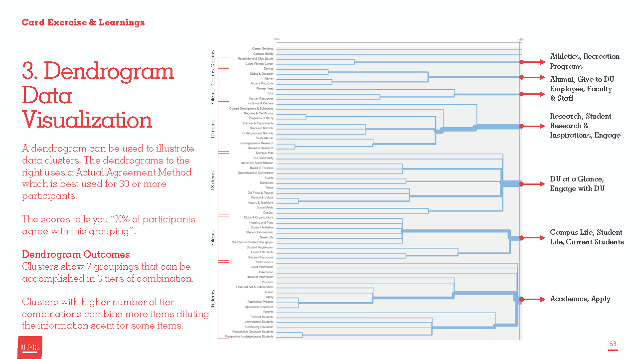
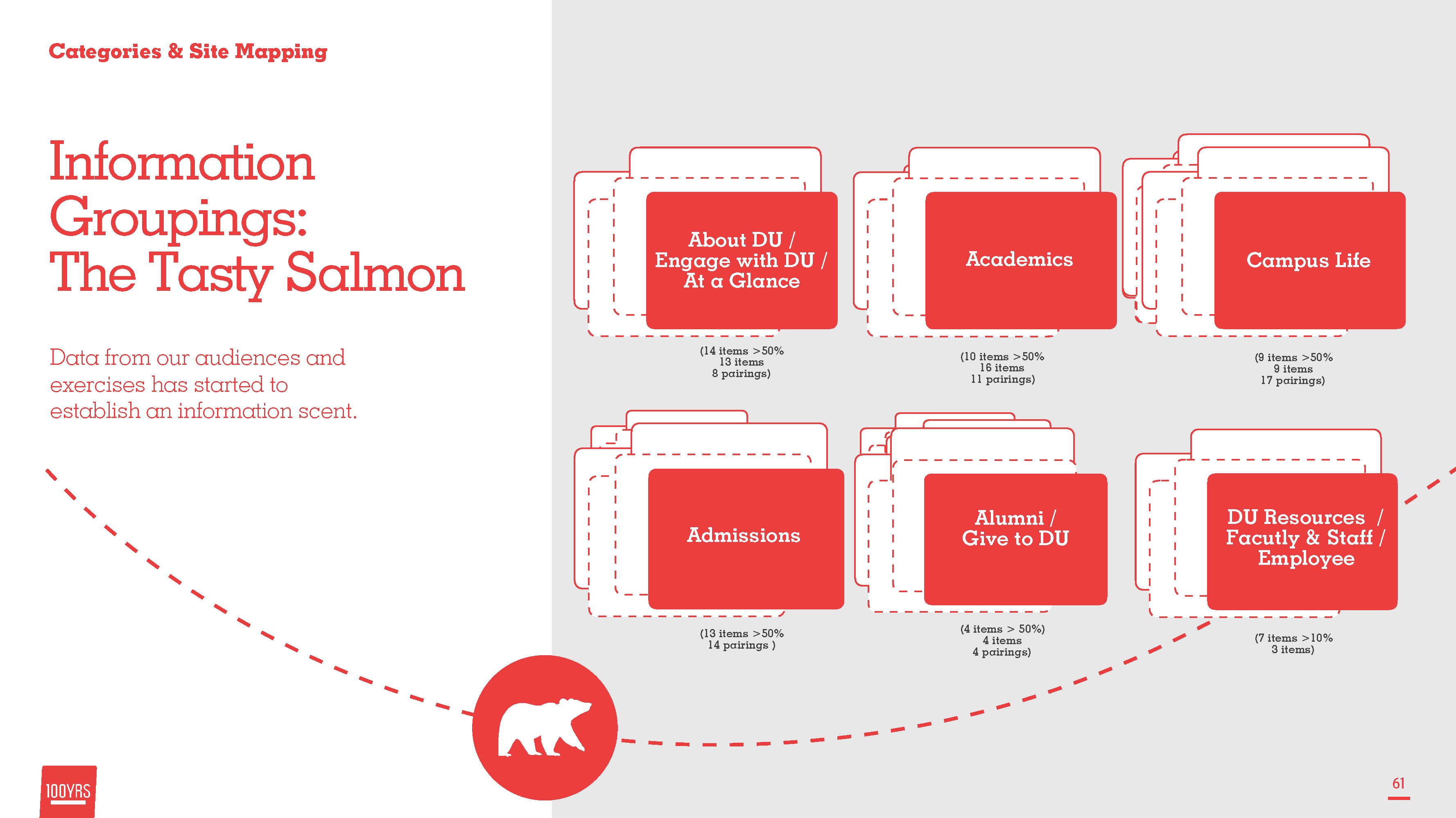
After doing Card sorting with a team of 20 participants we aligned on data driven grouping as a starting place for developing a User Interface navigation
AI is not a sitemap but does lead to producting a sitemap and ultimately a user interface.
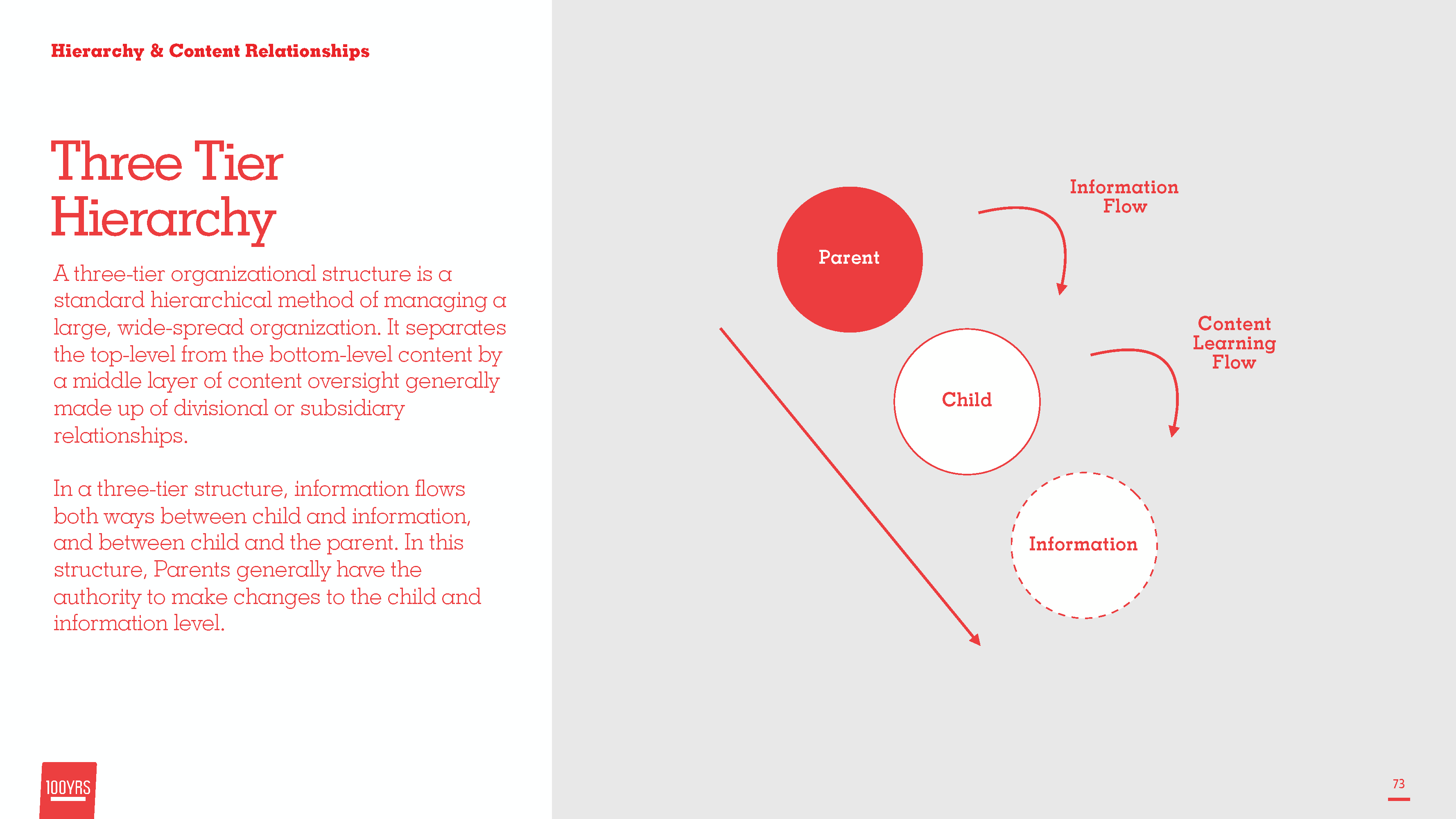
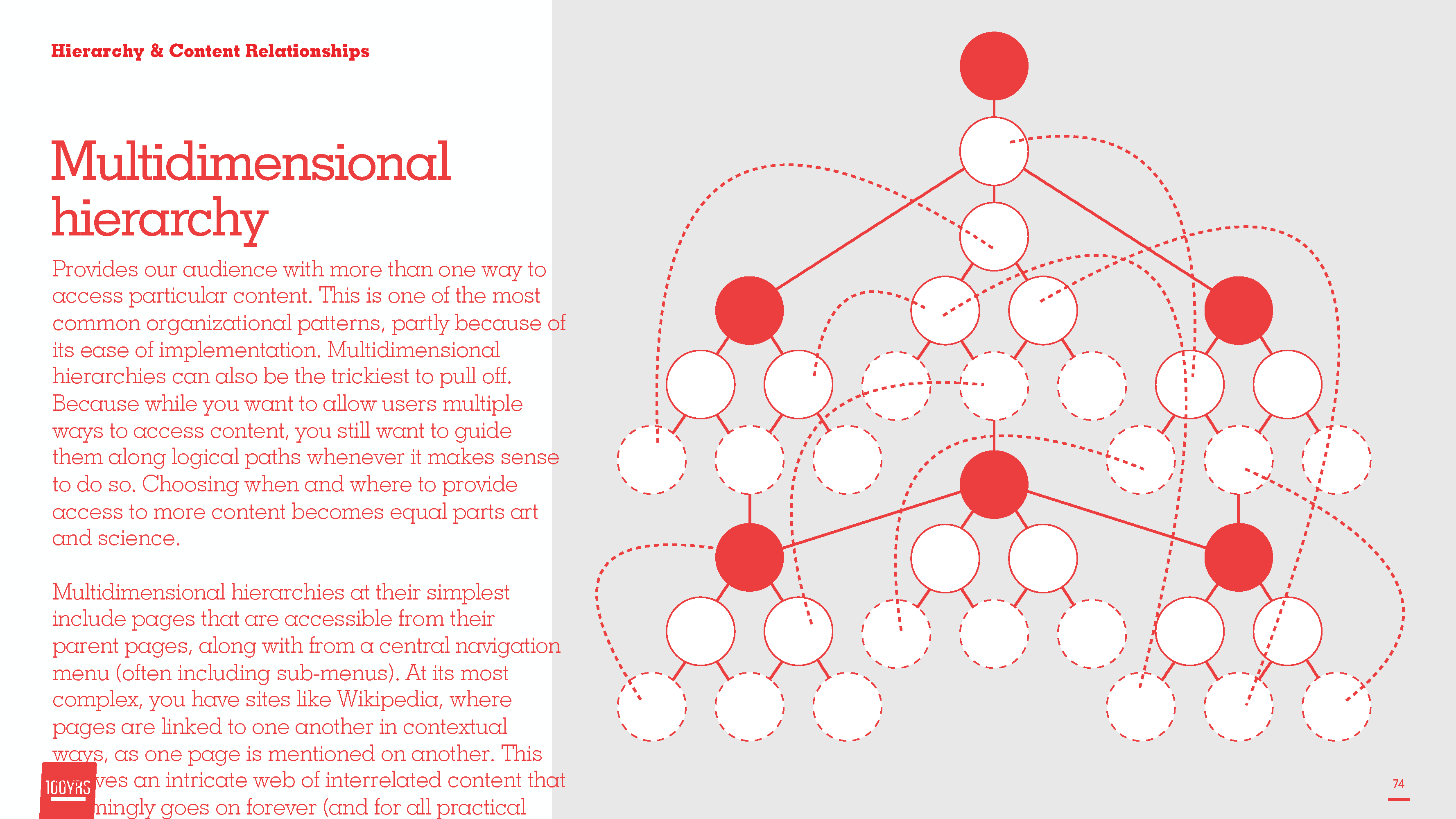
AI is not a sitemap but does lead to producting a sitemap and ultimately a user interface.
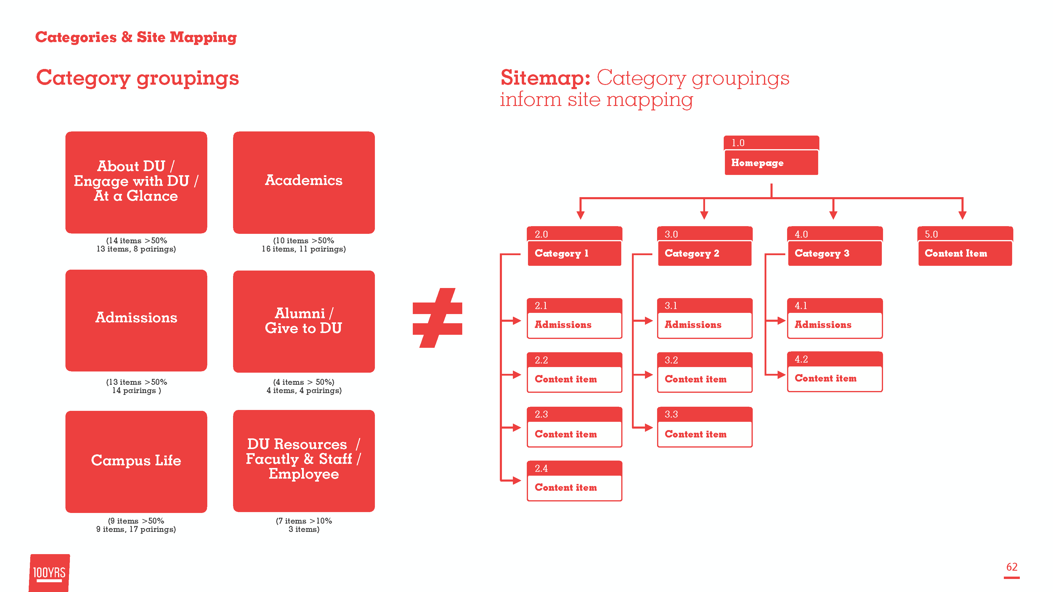
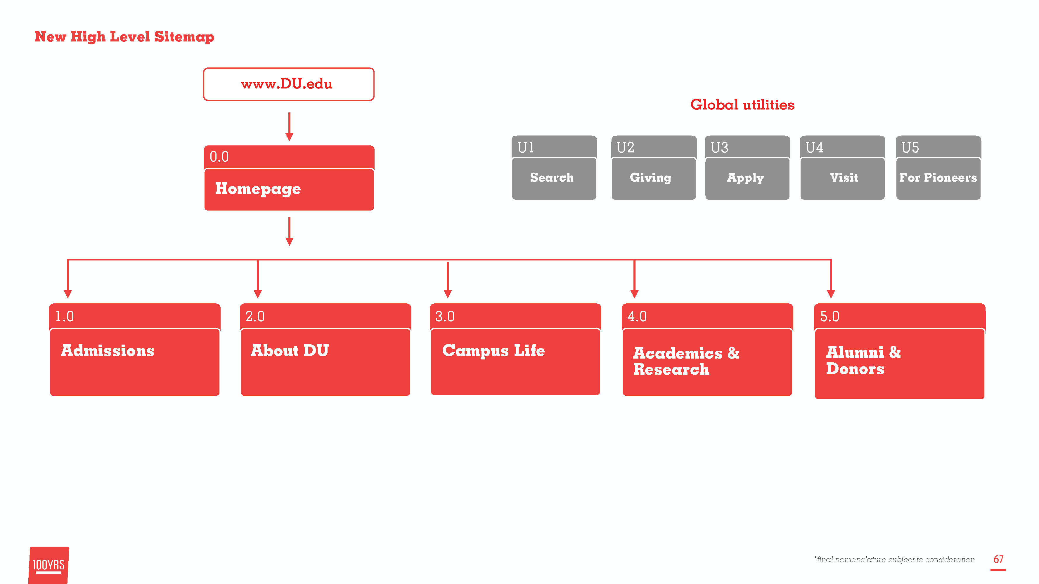
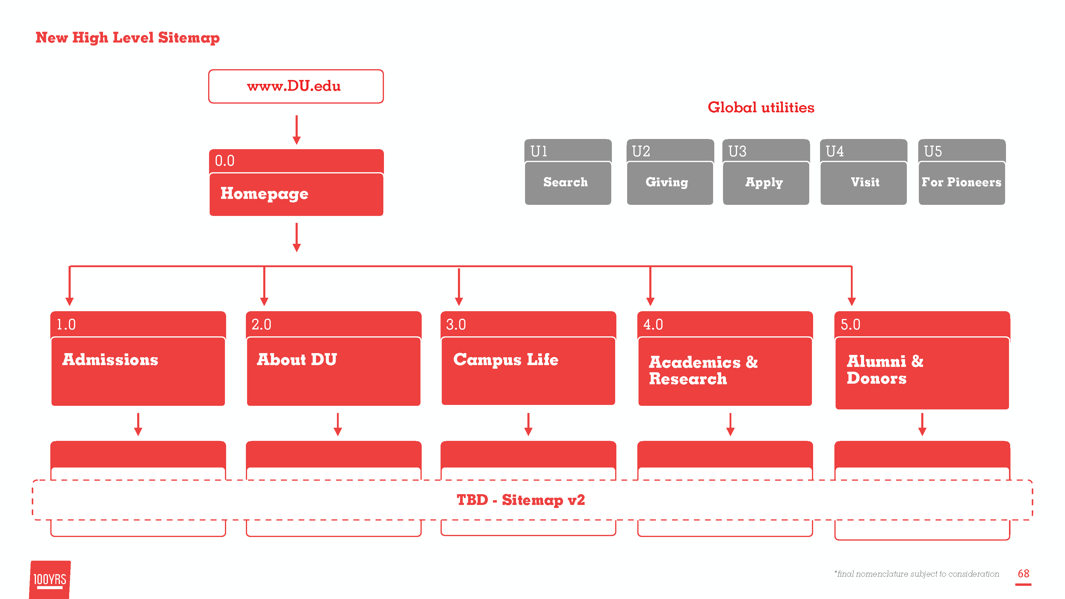
The sitemap was then locked into and generated to help DU.edu restructure its content.
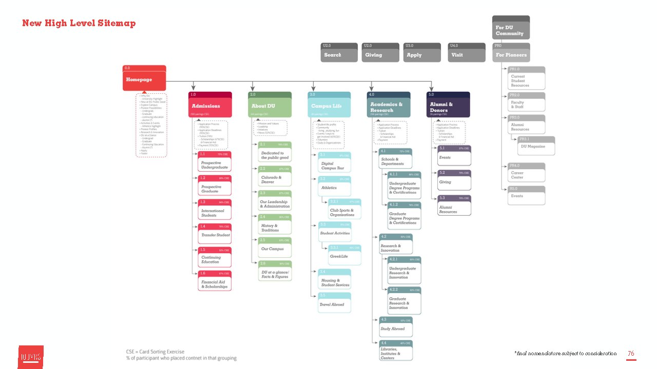
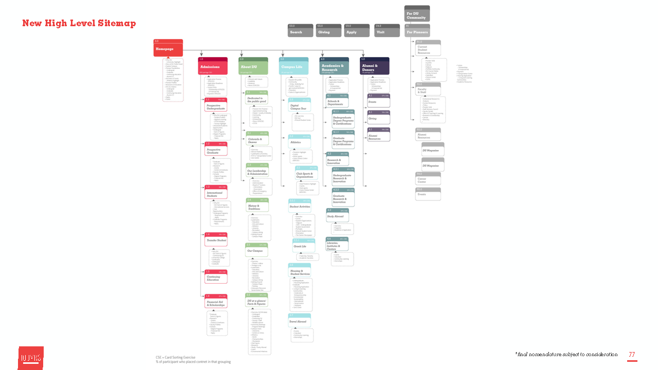
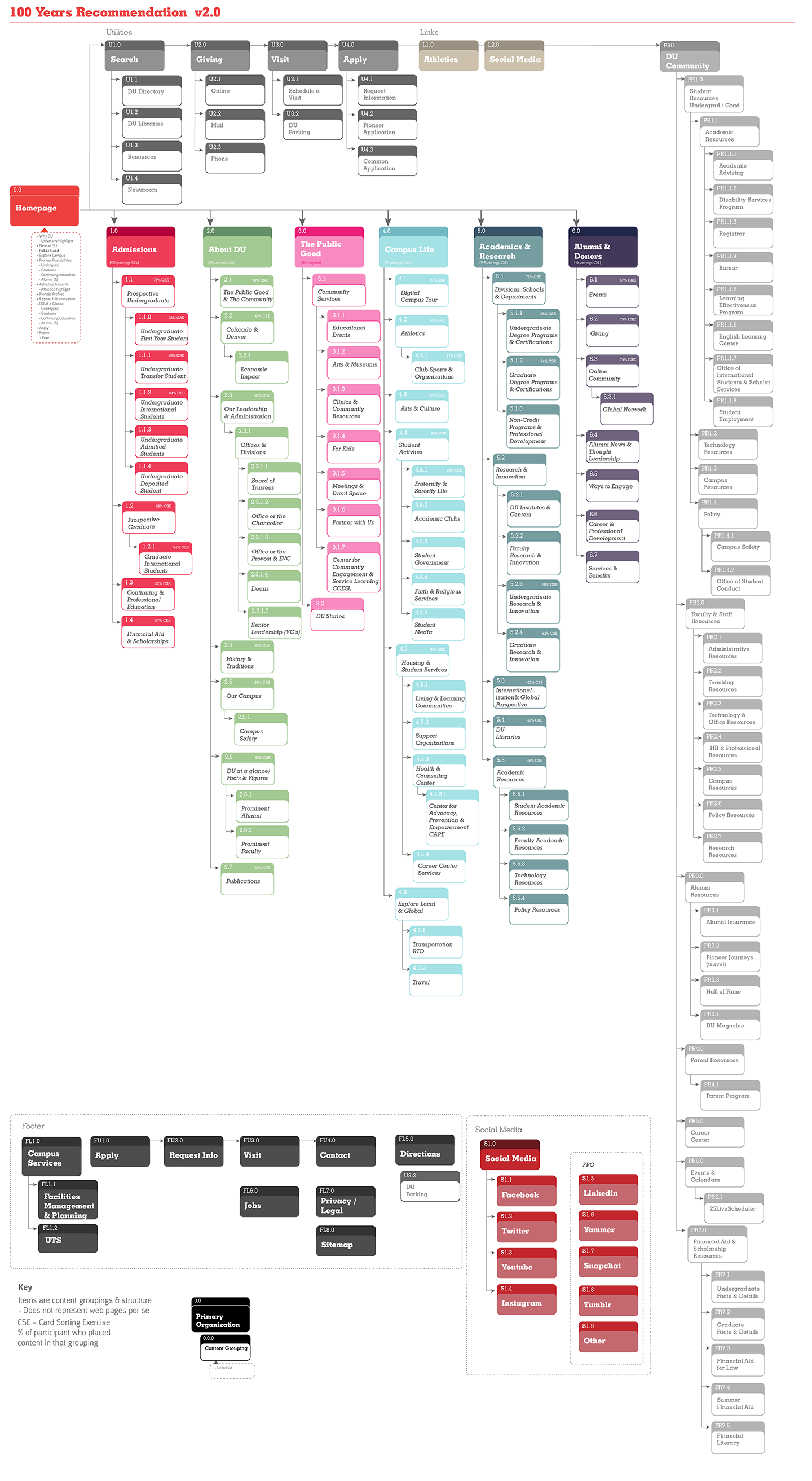
AI is not a sitemap but does lead to producting a sitemap and ultimately a user interface.
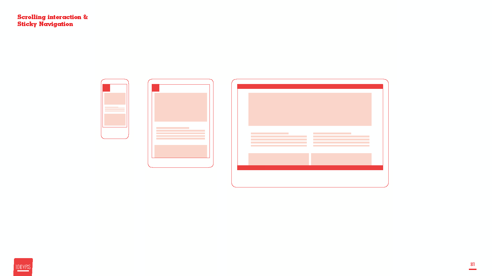
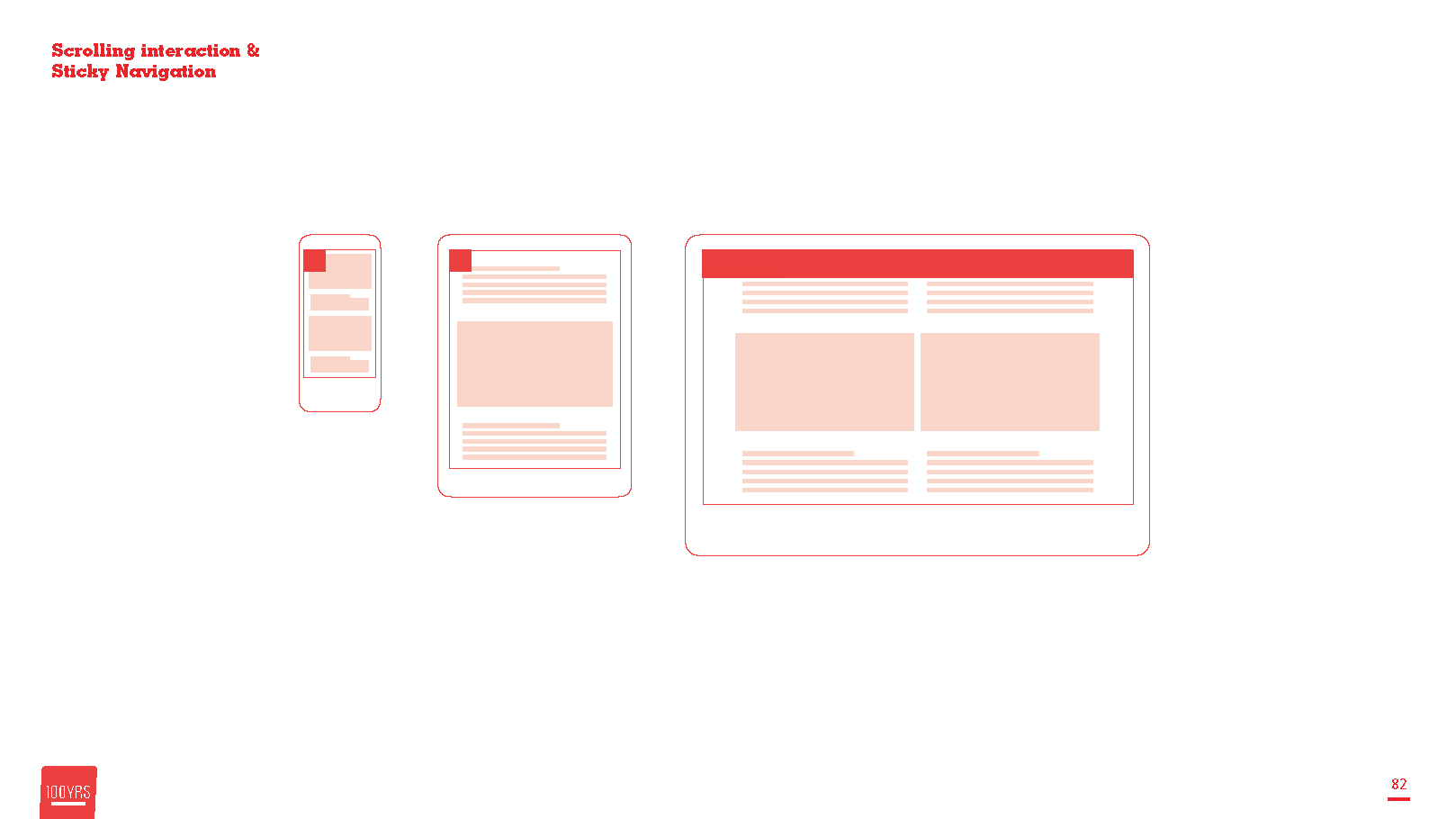
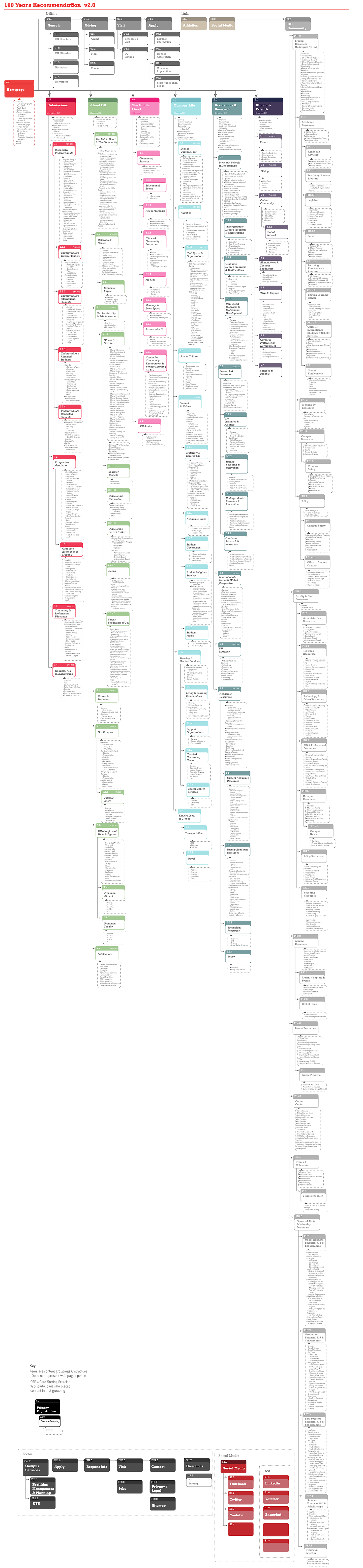
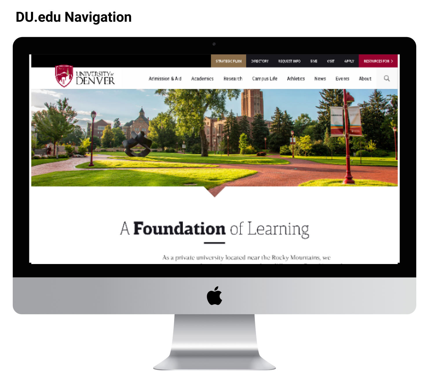
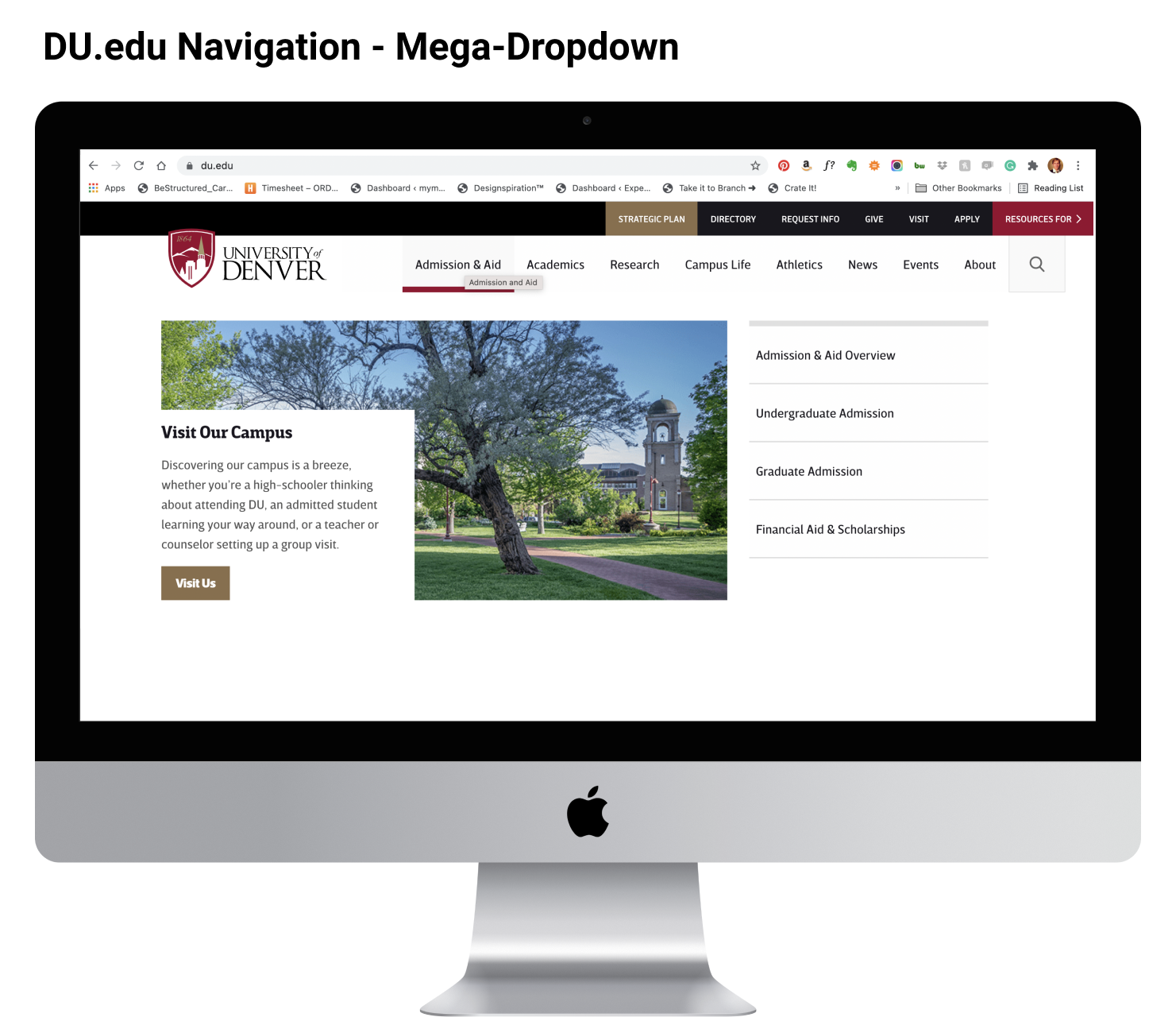
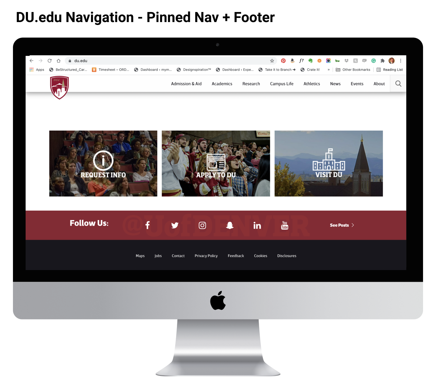
Desktop User Interface
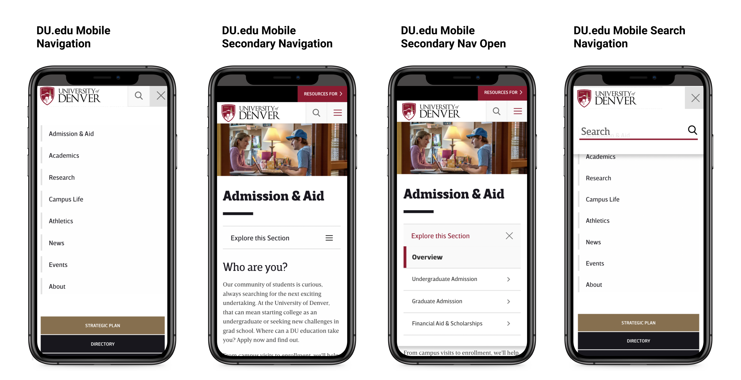
Mobile User Interface
 Go to DU.edu Website
Working with our team we recognized that the organization was only so flexible or able to make decision as a certain pace. This led us to very different outcomes then orginally anticipated.
1. AI and Navigation are never really finished just improved upon
2. UI Navigation is negotiated and has to be flexible enought to accomidate both users needs and institutional needs
3. Information architecture should be informed by data but not dominated by it.
Information architecture is not a luxury that only big projects get to concentrate on. The DU administration discussed and contemplated the navigation updates for a longer period of time than anticipated because changing it had such deep implications to their institution. Usability, user-center language, and clear logic are things we as a UX team wanted to infuse into the Navigation solution. Working with large groups of stakeholders means being willing to push and pull ideas. The reality is we worked very hard to get to a final solution but it is not etched in stone. A website is a living breathing entity that can and should be improved over time. Our solution for the DU navigation gave them enough room to implement new ideas but maintained a solid foundation for users to be success at navigating the website.
A broader customer journey map that represented the emotional journey of the DU.edu student users along the process.
View Behance Case Study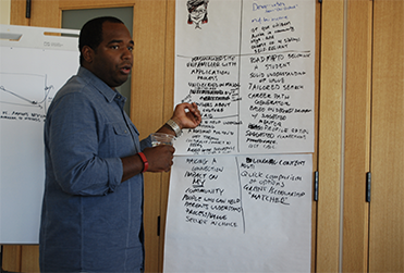
Working with DU.edu. I created a design thinking workshop to build empathy and infuse user research into the web design process.
Behance Case Study